Branding inconsistency is costing you a pretty penny

Imagine grabbing a can of Coca-Cola from a vending machine. You hear the familiar sound of the aluminum plunk through the machine, as your hand reaches instinctively for the cold can. Something is off, though. The can is navy blue. Oh, and they changed their logo font. It’s Helvetica. What does this mean? Did they change their recipe too? Did someone buy them out? Is this even real Coca-Cola? You’re probably a little scared to drink it now.
Chances are your company isn’t as large as Coca-Cola, but that doesn’t mean branding shouldn’t be just as important to you. A brand is more than what people see; it’s how it makes them feel. Consistency builds trust which is the foundation of loyalty.
What does branding mean and what does it encompass?
Branding is not just your company’s logo and color palette, although both are critical. As a designer, there’s nothing worse than seeing your logo design stretched out, pixelated, or used with the wrong color, branding is much broader than those two elements.
Effective branding includes:
- Messaging and copywriting – your brand’s voice
- Fonts and type styles (headlines, body copy, quotes and call-outs, etc.)
- Colors
- Patterns, textures, photography and graphic design styles
- The rules (templates for spacing, white space, the basics)
The importance of brand consistency
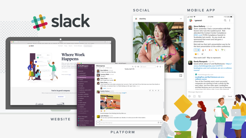
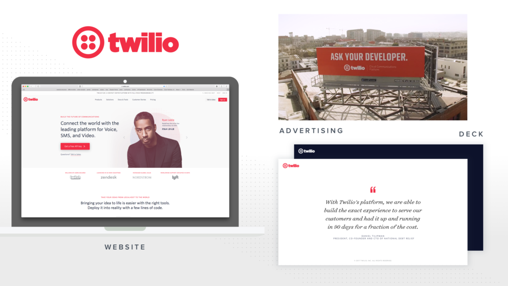
Consistency is the key to a successful brand. Whether you’re an enterprise or startup, have 100 designers or a team of one, brand new or have been around for decades, this affects you. We know creating an intriguing, interesting, and creative brand appearance around tech can be challenging. As Paul Rand once said, “Don’t try to be original; just try to be good.” Here are some examples of brands who are doing it right:


The common element these brands share is their steady appearance across all platforms – their website, social media platforms, emails, apps, trade shows, swag, and even physical products created through print on demand services. They have brand standards and they stick to them 100%. The same principle applies to promotional strategies like offering a gift with choice, when executed consistently within brand guidelines, it reinforces trust instead of creating confusion.
The negative impact of inconsistencies
In the article The Psychological Reason Why Brand Consistency Is So Important, the author states, “having inconsistent visuals makes the process of nurturing trust and becoming remembered a nightmare — you’ll be introducing yourself to them for the first time every single time.”

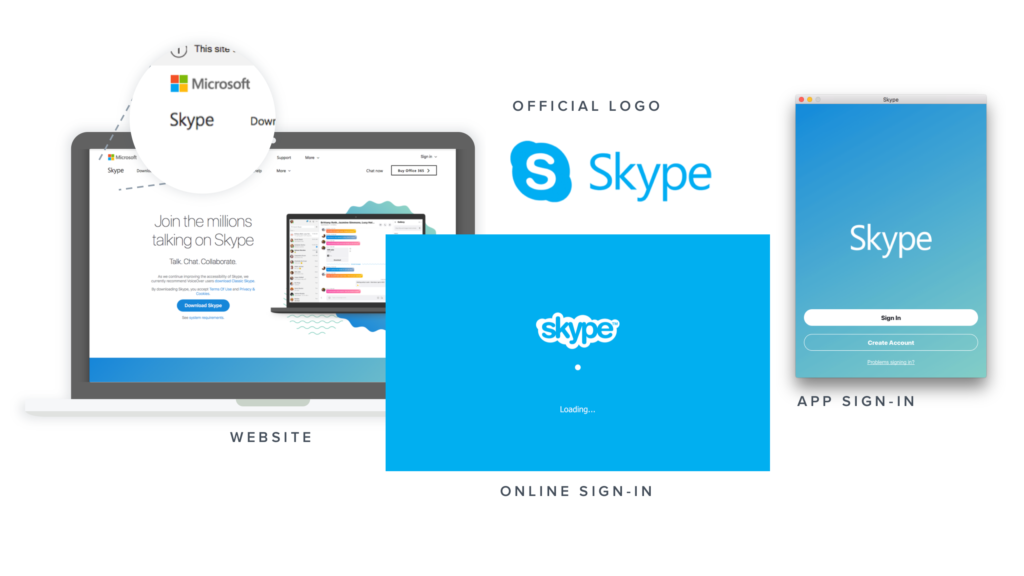
Recently, Skype went through a rebrand and didn’t dot all their i’s or cross all their t’s. In the above example, you can clearly see four different versions of their logo used simultaneously on four different platforms: their website, online platform, app and “official logo”. The greatest negative impact of inconsistent brand usage is the creation of confusion in the market. This also plainly proves this issue isn’t limited to start-ups or small design teams – it happens across the board.
“The average revenue increase attributed to always presenting the brand consistently is 23%”
So, what’s the real reason you should care? Inconsistencies are costing your company time and money. According to latest Brand Consistency Benchmark report, “The average revenue increase attributed to always presenting the brand consistently is 23%”. The impact affects the communication with existing customers, the ability to quickly close sales or generate and nurture leads, as well as internal communications with employees. Conflicting brand usage accounts for a 56% damage to brand credibility, making it nearly 30% harder to compete in the market.
In a nutshell, designing, developing, and maintaining a brand is certainly a daunting task and public awareness is a process. We at ActiveProspect continually strive every day to be better. Did we miss anything? Reach out and let us know!


